TX Whiskey:
Go Boldy
Brand Identity
Brand Guidelines
Packaging Design
Art Direction
Illustration
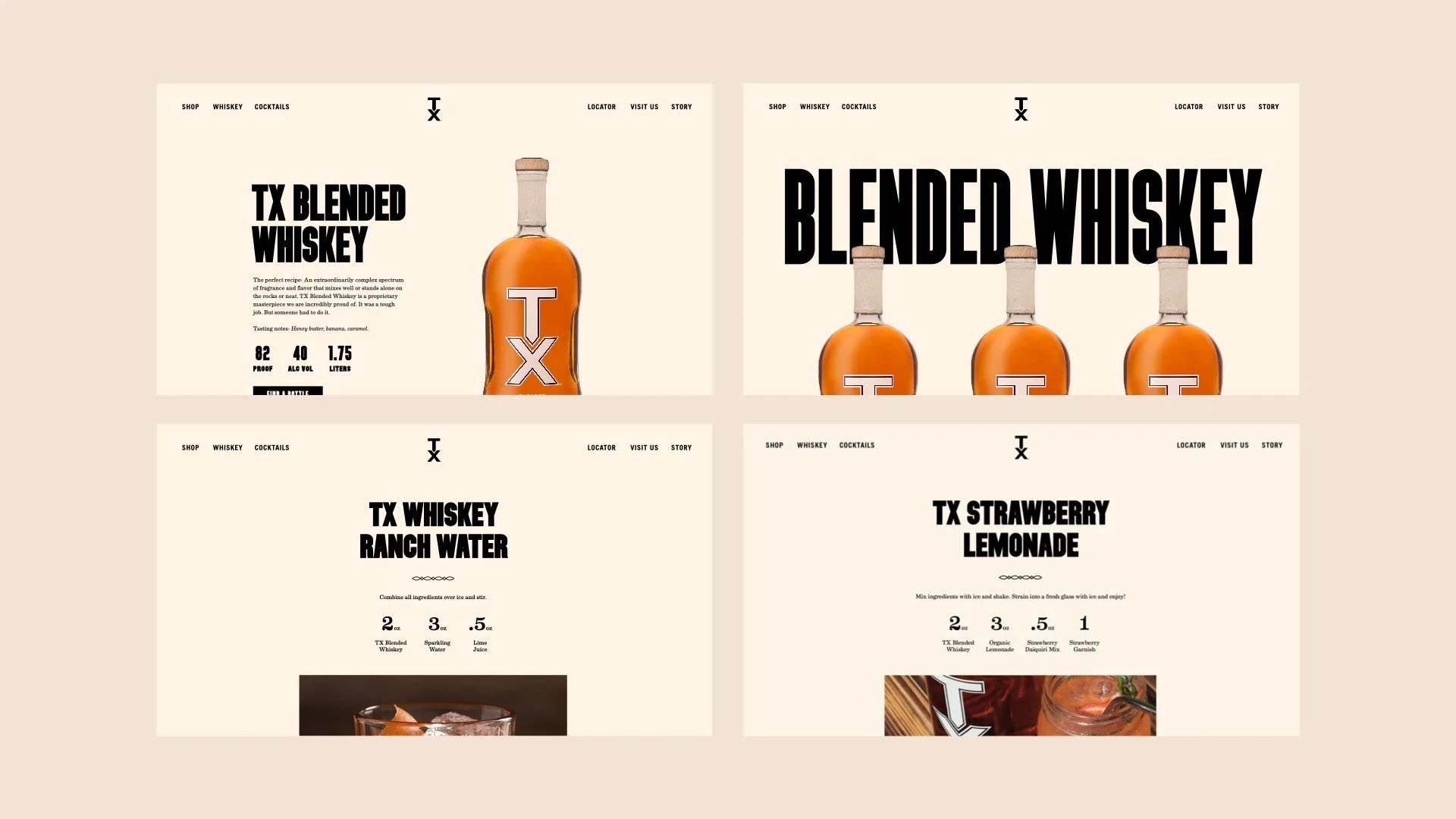
Knoxville based agency Tombras brought us on to help redefine TX Whiskey’s brand identity. TX is a staple so it was important that we stayed true to the brands roots and not completely overhaul the strong foundation that brand had already built. We started with the iconic TX monogram, improving the geometry, correcting the extended versions, and creating tighter rules around usage. We then updated the color palette for more variety and introduced a few new typefaces that better reflected the brands bold personality. To broaden the visual style, we also developed a series of typographic lockups, iconography, and illustrations for signage, merch, and packaging. We had the opportunity to design TX’s line of canned cocktails too, which we kept simple, highlighting TX on the front and each flavor through a colored band at the bottom.
Collaborators: Twelve Midnight