Mate Maker Co:
Brew a Better Tomorrow
Brand Identity
Brand Guidelines
Packaging Design
Art Direction
Illustration
At the heart of Mate Maker Co is a simple question: if you choose to drink, why not drink better? Justin Medcraft, the electronic trio RÜFÜS DU SOL, and Tom Appleton embarked on a mission to answer that question. Thus, Mate Maker Co was born—a clean label Hard Kombucha brand that embraces transparency.
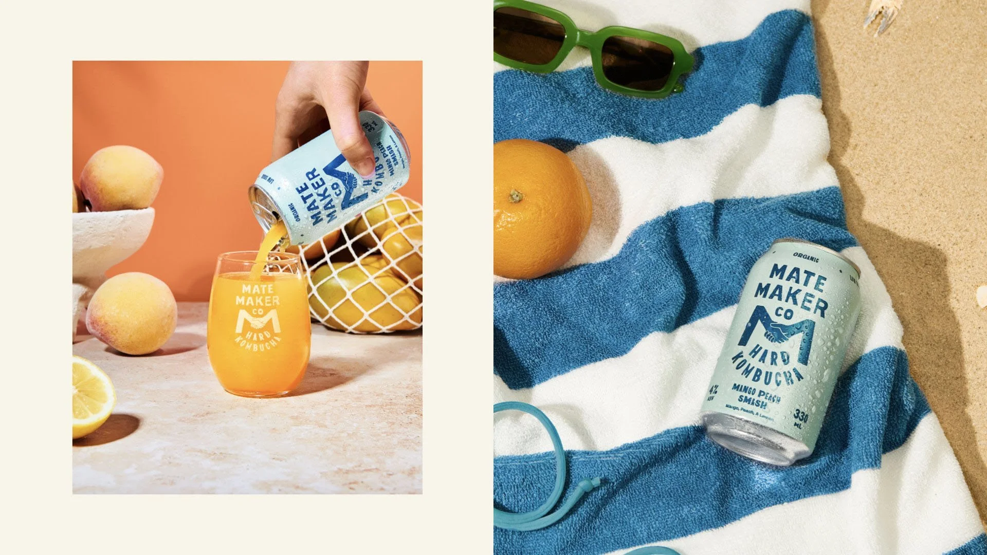
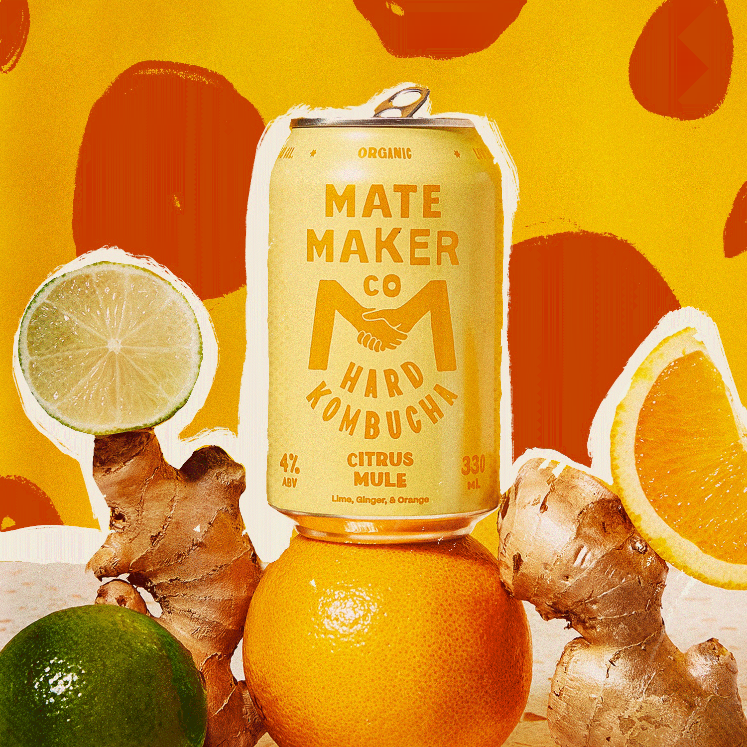
Aligning with the value of transparency, we focused on designing the brand and packaging with the iconic M monogram at its core. This monogram symbolizes Mate Maker's mission of creating organic, sustainably-minded beverages that bring people together.
Furthermore, we developed a dynamic visual style incorporating typographic lockups and coastal-inspired elements. These elements not only breathe life into the brand beyond the packaging but also evoke a sense of the coastal lifestyle that Mate Maker represents.